The Design Ethos of Indy Miranda - Pastelle
Today, we are talking with Indy Miranda, the Founder of @_Pastelle.uk. Indy is a Industrial Designer from the United Kingdom, designing and crafting fingerboard obstacles such as the Alvar Pool. We REALLY went one step further in this conversation about design, craftsmanship, and fingerboarding. We hope you enjoy this article as much as we did creating it!
Here is the Design Ethos of Indy Miranda.
Indy Miranda, Founder of Pastelle / Photo by: John Green
(NY) How did you get into designing fingerboard obstacles?
(IM) During the start of my second year studying Industrial Design at university we were handed a small brief to create a 3D object for our digital design module. At this point, I had been fingerboarding for over 10 years and had always wanted to make my own boards, so I decided to design and prototype a deck shape in the university workshops using CAD software and a 3D printer, which kickstarted Pastelle. It was my first experience of a truly iterative design process. I spent the first couple of months of sleepless nights in a state of flow. I was learning the skills necessary to make fingerboards at the same time as I was figuring out the design process. I quickly discovered that the hands-on experience of studying and producing the various versions of an object and overcoming problems on the go was extremely addictive. Unfortunately, that development process came to a halt when the global pandemic saw us out of the workshop and confined to our student homes. I had to put that project on pause wishing I could get back to the workshop and experience that state of flow again.
Fast forward through the next 3 years, which I spent graduating and working with industrial designer John Green, I quit my design job to move to London and pursue the next step in my career. At the same time, UK brands Cartwheels, Axe Ramps, and Arbeia were organizing a small fingerboard event on the south coast of England and I saw the chance to contribute and revive that feeling.
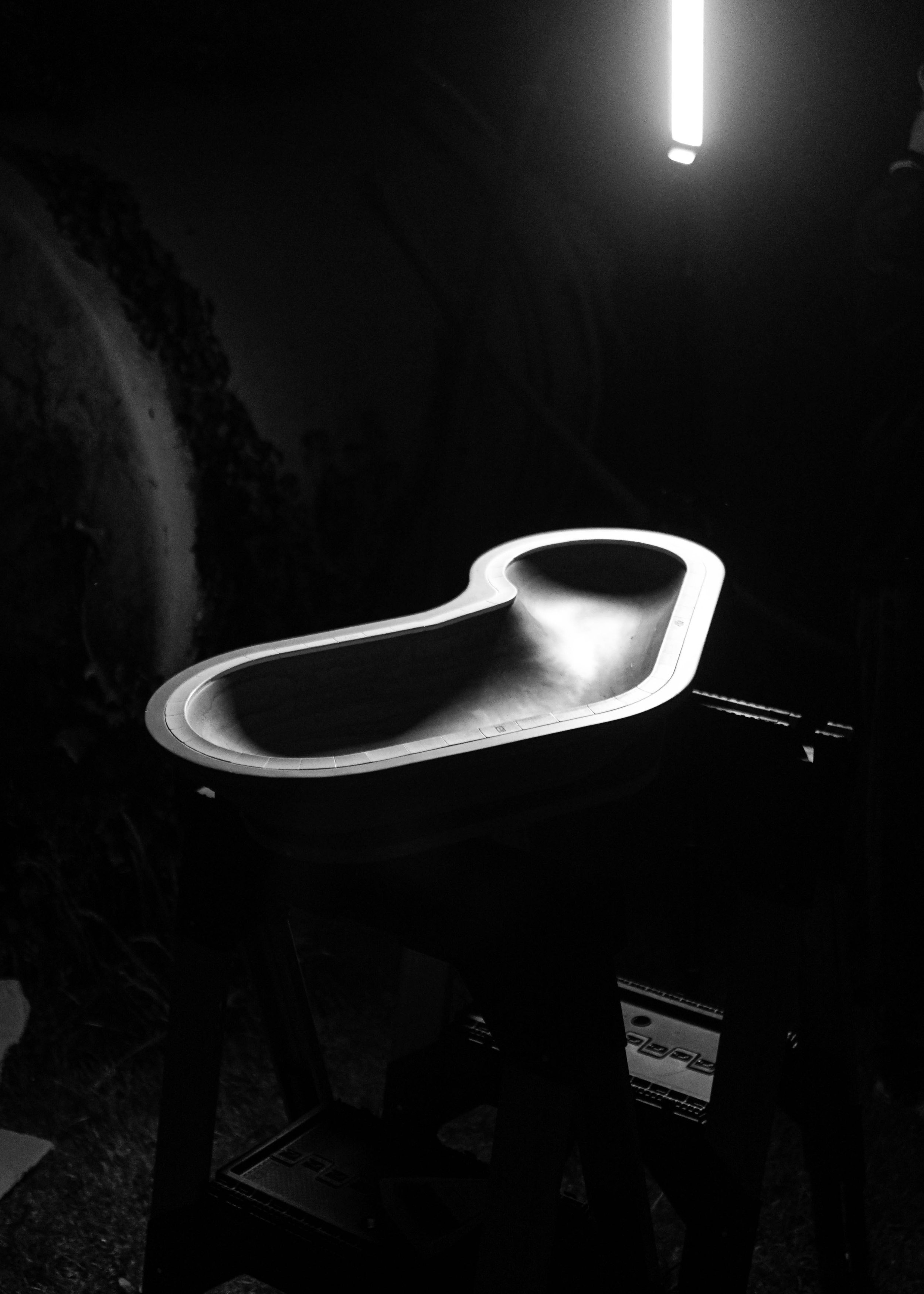
I had been thinking of designing a pool since going to the ASI shop with my good friend Mauro Casas in 2019 and becoming obsessed with riding the Crazyleg example at the shop. The time to get into that flow state had finally come. I had potential access to a workshop, newly acquired design skills, and heaps of free time. After four intense weeks of designing and developing a concept for a fingerboard pool, I completed the first production prototype of Alvar, which commenced my journey into designing fingerboard obstacles.
In hindsight, it seemed like a natural progression to combine my passion for design and fingerboarding. Nowadays Pastelle acts as my creative outlet and a way to refine my design process through experimenting with new manufacturing techniques, materials, and the feedback I receive from the community.
Alvar Pool / Photo by: Indy Miranda
(NY) What is the brand identity and design ethos of Pastelle?
(IM) When deciding on the purpose behind Pastelle, I looked up to a company I had studied closely, Muji. Unlike typical lifestyle shops that try to catch your attention with flashy graphics and to sell products based on trends rather than functionality, stepping into any Muji store feels like a pleasant and familiar experience. With a glance at their products, you can instantly recognize their function, without the need for exciting descriptions or graphics. This paired-back approach combined with purely functional signage means that no matter what Muji store you visit, the experience remains the same.
Another thing that stands out about them is that their product catalogue and brand image remain mostly untouched throughout the years. It sometimes surprises me to think that an object like their infamous aroma diffuser was designed back in 2014 but could have been released yesterday. Through a limited design intervention inspired by necessity rather than growth, simple design interventions allow their products to blend into people’s environments and for the brand to stand the test of time.
Pastelle aims to provide a similar experience by providing functional objects that are crafted for life and inspire creative ways of fingerboarding. Serving fingerboarders and the people they live with in ways that don’t immediately respond to the hobby, I hope that these objects will be cherished and stand the test of time. Using simple, consistent, and honest branding I can communicate those intentions as clearly as possible, which hopefully translates well to ever-evolving consumers both inside and outside of fingerboarding.
Trivet prototype / Photo by: Indy Miranda
(NY) What are some important design elements you put into consideration when designing a new product?
(IM) Countless design elements are considered when creating new products. However, there are a few key elements that are worth highlighting.
Dieter Rams put it best in his manifest ‘The 10 principles for good design’, a product has to look good, but it is essential that it performs its intended task exceptionally well. To achieve effective functionality it is essential to understand the problem at hand. In turn, this will inform design elements like usability or ergonomics, which will ultimately dictate the form of the object and serve as a basis for all the design decisions that follow.
Once I understand the function, the material chosen has to synergize with the object’s intended purpose. This is also a time when I can focus on the sustainability aspect of design or how it will be manufactured. Objects that stand the test of time share in common the use of high-quality materials, which in my opinion is the best way to approach sustainability.
Finally, I make sure that longevity is considered in the design process. When attempting to craft an object for life you have to think far ahead in the future about how a product might evolve over time. A smartphone with a glass back and front might look attractive and innovative at a first glance, but those enticing elements quickly fade away when it slides out of your pocket and shatters into pieces, rendering it useless (I am looking at you, Apple).
Without understanding the necessity for a product and considering these factors, we can only be sure that any design intervention won’t provide a meaningful improvement over existing products.
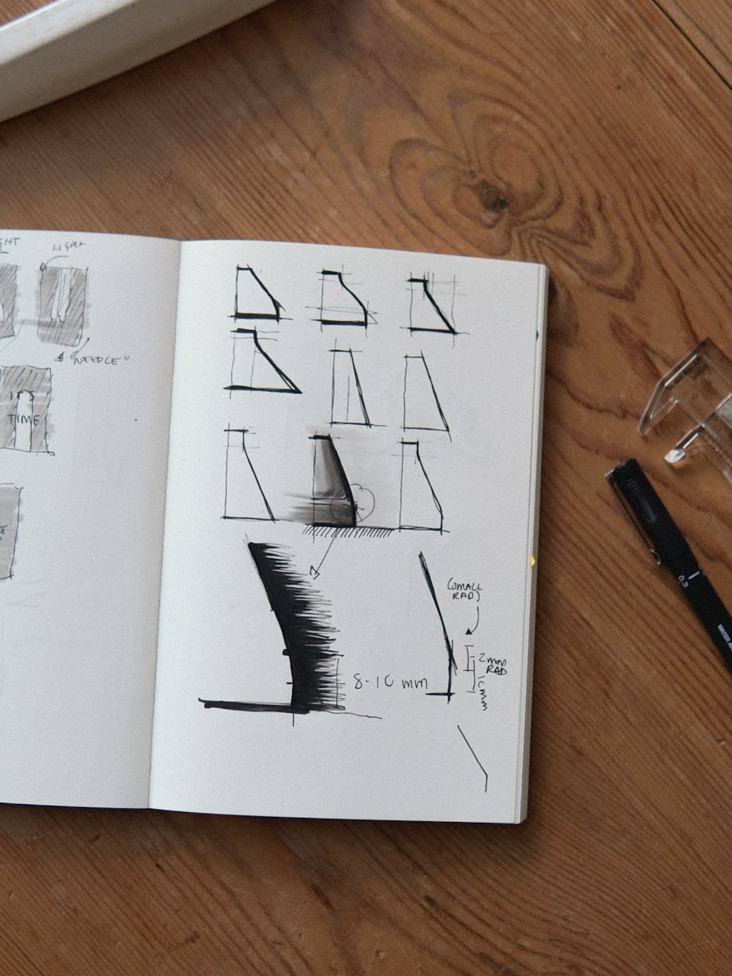
Sketches / Photo by: Indy Miranda
(NY) Is there a specific element that you never include (or never exclude) in your designs?
(IM) As an industrial designer, the design process for me is a fine battle between nurturing the details that make a product functional and instantly recognizable, and renouncing any decorative elements that will detract from its core purpose.
I admire the words of designer Naoto Fukusawa, who believes that ‘decorativeness or ornateness for the sake of appreciation are far removed and separate from useful beauty’.
However, the conscious decision to eliminate unnecessary details in the search for functionality can often be confused with ‘minimalism’. As a style, minimalism aims to remove details in order to reach an aesthetic ideal, which will often compromise the functionality of an object. Take Apple as an example again. They removed most USB ports in their lineup of laptops for mere ‘simplification’, sacrificing the functionality that industry-standard USB ports and SD card slots provided to their customer base. These were quickly replaced by external dongles, which quickly backlashed and after harsh criticism, it forced the company to re-introduce these ports into ‘some’ of their latest laptop models.
For me, renouncing unnecessary details that don’t serve a product’s core functionality often results in a simple-looking object, almost ‘not designed’. This supports the intention for the objects I create to stand the test of time.
Photo by: Indy Miranda
(NY) Observing your brand and the product line, it reminded me of high-end furniture brands. Was that intentional when you started Pastelle?
(IM) Originally when I started Pastelle back in 2019 the branding was completely different. At the time I had a drawing tablet and a lot of creative energy. I based the logo and identity of the brand around a hand-drawn version of Futura ND and would hand-draw on every package.
After graduating and working in the industry I felt like my approach had matured and I wanted for my branding to reflect that. I learned a lot about how design-led furniture brands were portraying themselves by assisting John Green with his photography and through constant observation. I felt comfortable taking inspiration from how these companies portrayed themselves since their values align with Pastelle, which resulted in simple, clean, and functional branding.
The distinctive factor between these brands and us is how refined their content can be. Although my intention for the branding is to look as professional as possible, the reality is that with limited resources it is often impossible to achieve those standards. I have learned to embrace the small imperfections and quality sacrifices needed to have a healthy(ish) work-life balance. I think this slight roughness adds to the authenticity of Pastelle, as the hand-crafted products themselves also face the limitations of my small workspace and limited resources.
Photo by: Indy Miranda
(NY) Where do you get inspiration for a new design?
(IM) My sources of inspiration are diverse. In the case of Alvar, I had been thinking of designing a pool for years. During my first trip to the ASI Berlin shop and Fast Fingers in Germany I got to try a lot of parks and pools, which I kept the back of my head all these years. When the time came to design and produce our pool, I brought back those memories and experiences, which strongly informed the design. I combined this with an admiration for the work of Finnish architect Alvar Aalto, who inspired the kidney-shaped pools that were the origin of pool skating in California in the 70s. In the case of our new product, Trivet, the inspiration came from observing daily habits and how the home objects I was living with could be re-imagined through the lens of fingerboarding.
I was growing frustrated at the thought that the fingerboard obstacles I have been collecting all these years are often forgotten in boxes as they don’t provide with a function outside of fingerboarding. It was then that I realized that there was an opportunity to create functional objects that would become part of our space as well as provide me with opportunities to fingerboard more often.
I was playing around in the kitchen one day when I realized that the cork placemat we had been using to put our hot pans and oven trays at the dinner table was a fantastic manual pad. My mind immediately started exploring the possibilities of a heat pad to act as different fingerboard obstacles. Shortly after, our landlord needed to replace our gas hob, which I had also been using as a makeshift rail, and the prong-shaped structure inspired me to think of this heat pad as a grinding obstacle rather than a manual pad.
Keeping an open mind and observing the different ways in which we interact with objects and the world around us is the main source of inspiration for my designs.
Alvar Pool in detail / Photo by: Indy Miranda
(NY) How long does it take on average when you create a new design for an obstacle? Moreover, what is your design process (from coming up with a concept, selecting colors, etc.)?
(IM) Creating a new design always takes longer than expected, from the moment I get excited about an idea to holding the final object. It generally takes months of pondering about a single thought until it feels like the right moment to pursue it. Every design process begins before I get a chance to put pen to paper. Usually, an idea I have stored as a note on my phone or a drawing on my sketchbook will linger in my mind for weeks.
Since Pastelle is not my full-time job, I don’t usually sit down to have ideation sessions at the beginning of each project. It all mostly happens during the negative space in my day. At lunch breaks, on the train on my way to work, in the shower, all the way to right before sleep whilst I lay in bed. This allows external day-to-day observations to infiltrate my design process and can take an undetermined amount of time.
After I have pondered enough about an idea, I begin to explore different possibilities on paper. Sketching is my favorite part of every design, as ideas flow freely into the page and materialize in front of my eyes. At this stage, the design is still fluid and constantly evolving. For this, I use a 0.3 Uniball Pen, a single grey marker pen for shadows, and my trusty Pith dot-grid sketchbook.
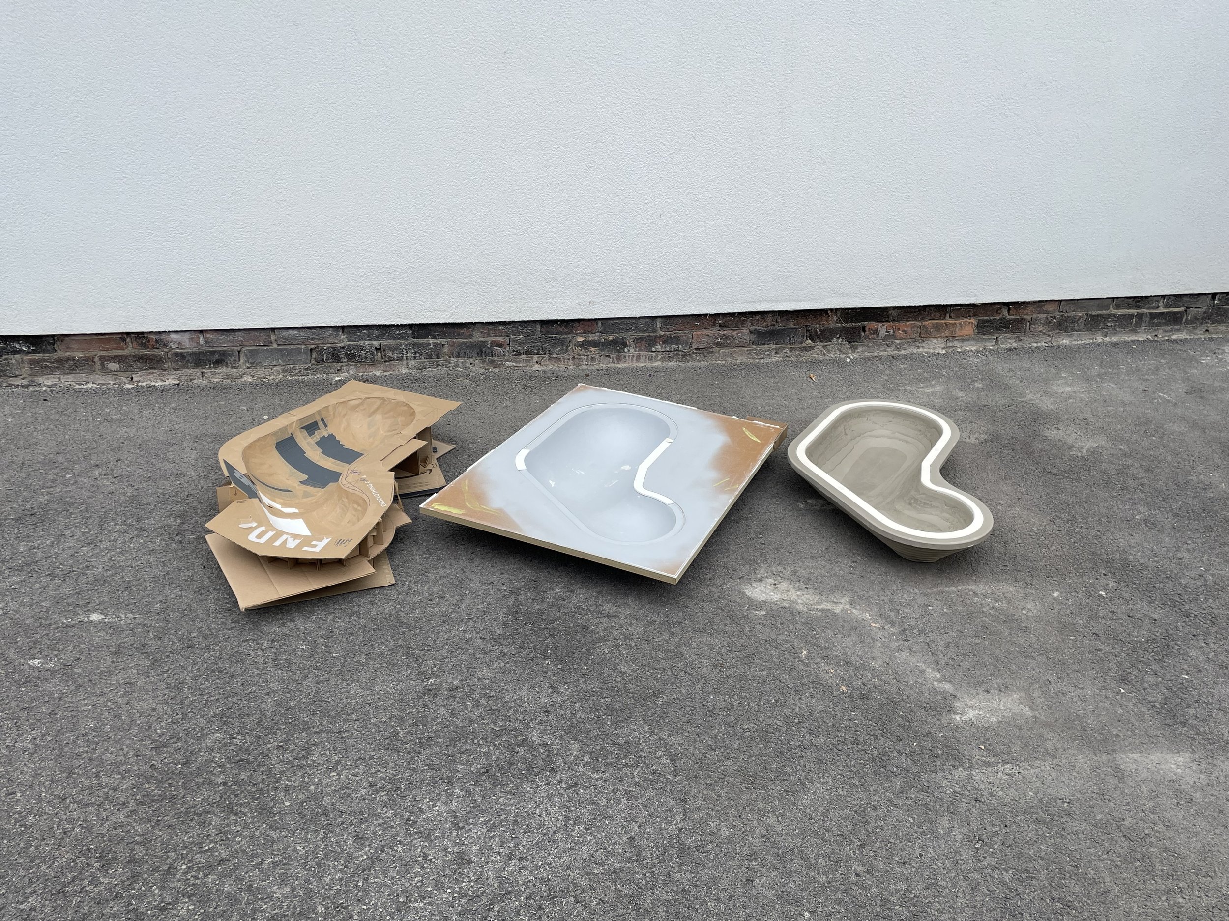
Once I am happy with a few of the ideas, I move on to physically modelling some prototypes. This gives a sense of scale and allows me to test ergonomics and functionality. When making cardboard prototypes of fingerboard obstacles I am reminded of the early YouTube days watching Mike Schneider build ramps out of cardboard mailboxes. When I get lost in fingerboarding on a cardboard prototype, I know I’ve achieved the right design.
I finally move into CAD, where I refine the design for manufacture and produce the first manufacturing prototype. This process is followed by testing and the loop will often repeat itself several times until the final result is achieved.
Photo by: Indy Miranda
(NY) In your opinion, do you think there are specific styles of design that suit some brands, but may not with others?
(IM) In short, yes. I perceive a brand’s style as a reflection of their values.
If I am trying to design objects that blend into the home environment, I might deliberately choose not to produce colorful objects reminiscent of a style like Art Deco, for example.
Alvar Pool CAD / Photo by: Indy Miranda
(NY) How should a designer interpret a brand’s identity into the design of their product(s)?
(IM) When it comes to designing for brands, it is important to respect a brand's heritage, unveil its core values through design, and propel it into the future. Understanding a brand’s identity is usually one of the first steps of the research phase. A designer might attempt to understand a brand’s values by gathering data on how a brand is perceived, paying homage to its heritage by taking a deep dive into that company’s product archives and filtering these aspects through a designer's inherent knowledge of the market and our evolving needs in the world.
Photo by: Simon Cartledge
(NY) What is a long-lasting design in your opinion?
(IM) I think I could write an essay on what I believe long-lasting design to be and how we can get there. However, to keep this answer concise, I will focus on a simple analogy. Everyone in their life has come across an object that has been designed for life but has been taken for granted. I imagine a wooden door wedge, for example. This is the kind of object often goes unnoticed, performing its duty perfectly without providing resistance, over and over again.
The function of design when creating objects of that status is simple; to use as little design as possible to create a perfectly functional object. The result is an object so easy to use that it goes unnoticed. An object so familiar that a replacement could never fill its place. An object so well made that it can be handed down through generations with pride. To me, that is a long-lasting design.
Trivet in detail / Photo by: Indy Miranda
(NY) In what ways should a designer digest and create their own unique style of design in a world today where ‘trends’ are the vast majority of the industry?
(IM) I believe that designers should focus on solving problems effectively and efficiently and avoid the temptation of creating new products to fulfill consumeristic trends or their egos. One thing that we all share in common is that our perception of the world is unique. Therefore, designers should nurture that and attempt to find solutions based on these unique points of view.
However, I welcome trends that stand to improve our quality of life and our planet, like a move towards sustainable materials and processes, accessible design, etc.
Photo by: Indy Miranda
(NY) What other interests (design related or not) do you have other than fingerboarding?
(IM) I have been practicing photography for over 14 years, enjoy traveling and observing different cultures, visiting museums and exhibitions, looking at architecture, and I am also an avid hip-hop fan!
Indy Miranda
Instagram: @_pastelle.uk


